User Tag List

View Poll Results: Worst WM logo is...

Voters
. You may not vote on this poll
  • WrestleMania 2

    26 100.00%
Multiple Choice Poll.
Results 1 to 27 of 27

Thread: Worst WrestleMania logo of all-time?

  1. #1
    Jobber slik's Avatar
    Join Date
    Aug 2015
    Posts
    17
    Mentioned
    0 Post(s)
    Tagged
    0 Thread(s)
    Rep Power
    0

    Worst WrestleMania logo of all-time?

    Which one is the worst...


  2. #2
    too big to fail Tainted Eclipse's Avatar
    Join Date
    Mar 2004
    Location
    i am between locations now
    Posts
    23,824
    Mentioned
    43 Post(s)
    Tagged
    0 Thread(s)
    Rep Power
    1004946
    ussr
    i like 33

  3. #3
    DB don't GAF Zeroice's Avatar
    Join Date
    Jul 2006
    Location
    In traffic
    Posts
    1,029
    Mentioned
    0 Post(s)
    Tagged
    0 Thread(s)
    Rep Power
    3431
    I'd go with 2000 only because it was called WrestleMania 2000.

  4. #4
    Multiversal Champion OD50's Avatar
    Join Date
    Jun 2006
    Location
    Stockholm, SWE
    Posts
    18,059
    Mentioned
    18 Post(s)
    Tagged
    0 Thread(s)
    Rep Power
    116549
    sweden
    WrestleMania 2 was pretty cool and fitting for it's time, it is very 80's with the neon sign style "2". 33 kind of looks like a Snickers bar doesn't it? Are Snickers sponsors for the show or something?

    I never liked the warped version of the classic WM logo they used at VIII.


  5. #5
    Multiversal Champion OD50's Avatar
    Join Date
    Jun 2006
    Location
    Stockholm, SWE
    Posts
    18,059
    Mentioned
    18 Post(s)
    Tagged
    0 Thread(s)
    Rep Power
    116549
    sweden

  6. #6
    I'm always watching you.. MMH's Avatar
    Join Date
    Nov 2001
    Posts
    34,174
    Mentioned
    131 Post(s)
    Tagged
    0 Thread(s)
    Rep Power
    236457
    13 for me, its just so lazy

  7. #7
    RKO Ozanne's Avatar
    Join Date
    Nov 2001
    Location
    That's what she said
    Posts
    11,836
    Mentioned
    0 Post(s)
    Tagged
    0 Thread(s)
    Rep Power
    9556
    13 is awful, whoever thought up that should be shot.

  8. #8
    Drink Champion Clive Plasma's Avatar
    Join Date
    Sep 2013
    Location
    London
    Posts
    5,661
    Mentioned
    7 Post(s)
    Tagged
    0 Thread(s)
    Rep Power
    67257
    Wrestlemania 13 was around when things like Angelfire was the basis for most websites, and everything had flaming text. At the time, it was pretty relevant. Now it looks dogshit.

  9. #9
    The Rosk
    Guest
    Quote Originally Posted by Ozanne View Post
    13 is awful, whoever thought up that should be shot.
    Bit harsh.

  10. #10
    E-Bow The Poster Rancid_Planet's Avatar
    Join Date
    Jun 2012
    Location
    ...where is Bill Casey?
    Posts
    26,756
    Mentioned
    63 Post(s)
    Tagged
    0 Thread(s)
    Rep Power
    1201099
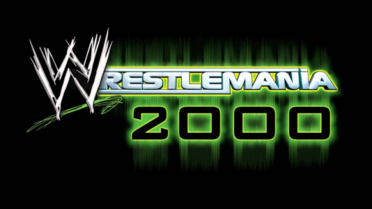
    The neon green of 2000 looks so dated now.

  11. #11
    Simon
    Guest
    Definitely 13, looks incredibly dated and shit now. Wrestlemania 2 looks great IMO, and I'm a fan of 15, 27 and 28 too.

  12. #12
    DB don't GAF Zeroice's Avatar
    Join Date
    Jul 2006
    Location
    In traffic
    Posts
    1,029
    Mentioned
    0 Post(s)
    Tagged
    0 Thread(s)
    Rep Power
    3431
    Is there anyone else who hates how they've done away with putting the number in the logo.

    We've had Wrestlemania NY/NJ

    Wrestlemania Play Button

    Wrestlemania Star

    And now Wrestlemania SunnyD

  13. #13
    Multiversal Champion OD50's Avatar
    Join Date
    Jun 2006
    Location
    Stockholm, SWE
    Posts
    18,059
    Mentioned
    18 Post(s)
    Tagged
    0 Thread(s)
    Rep Power
    116549
    sweden
    Vince being a genius decided that including the numbers made the event look old or some stupid shit like that. Here I was thinking that it actually added to an events prestige being around for a long time..

  14. #14
    Multiversal Champion OD50's Avatar
    Join Date
    Jun 2006
    Location
    Stockholm, SWE
    Posts
    18,059
    Mentioned
    18 Post(s)
    Tagged
    0 Thread(s)
    Rep Power
    116549
    sweden
    And yeah, they should bring back the Roman numerals.. XXXII is this years event btw.

    /Thinking about it, could the fact that 30-39 includes XXX being a reason for not using Roman numerals? PG era and all that.

    Maybe they'll bring it back for 40.. "WrestleMania XL"..
    Last edited by OD50; March 9th, 2016 at 6:01 AM.

  15. #15
    Drink Champion Clive Plasma's Avatar
    Join Date
    Sep 2013
    Location
    London
    Posts
    5,661
    Mentioned
    7 Post(s)
    Tagged
    0 Thread(s)
    Rep Power
    67257
    Quote Originally Posted by Zeroice View Post
    And now Wrestlemania SunnyD
    That's been done on purpose though. Orlando Citrus Bowl? Orange County Commission?

    I wouldn't be surprised if it ended up being sponsored by a juice drink of some sort.

  16. #16
    DB don't GAF Zeroice's Avatar
    Join Date
    Jul 2006
    Location
    In traffic
    Posts
    1,029
    Mentioned
    0 Post(s)
    Tagged
    0 Thread(s)
    Rep Power
    3431
    Quote Originally Posted by OD50 View Post
    Vince being a genius decided that including the numbers made the event look old or some stupid shit like that. Here I was thinking that it actually added to an events prestige being around for a long time..
    Vince likes to think of himself as "forward thinking" which is hilarious to me.

  17. #17
    Ironclad Contract RuneEdge's Avatar
    Join Date
    Jan 2003
    Posts
    15,998
    Mentioned
    16 Post(s)
    Tagged
    0 Thread(s)
    Rep Power
    182882
    Thats why he had that "fast forward" button on last years logo.

  18. #18
    Midcarder Dr_Seldon's Avatar
    Join Date
    Jul 2006
    Location
    Stockholm
    Posts
    287
    Mentioned
    1 Post(s)
    Tagged
    0 Thread(s)
    Rep Power
    2967
    Voted 13. Even if I strongly dislike that 2000 uses the year instead of a number like all the others, the question was of the actual logos, and the logo for 13 is just bad.

  19. #19
    World Champion Donald's Avatar
    Join Date
    Oct 2013
    Posts
    25,761
    Mentioned
    447 Post(s)
    Tagged
    0 Thread(s)
    Rep Power
    3253389
    usa
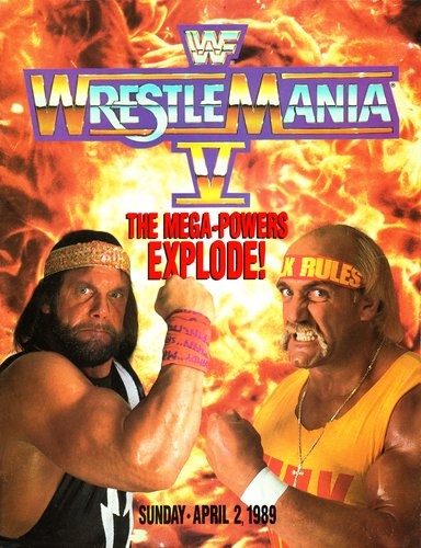
    Voted 13, looks horrible. WrestleMania XI was always my favorite.

  20. #20
    Simon
    Guest
    Even though I like some of the later ones, I kind of wish they'd stuck with the classic look which spanned the first event up to Wrestlemania VI (barring the snazzy electro one for WM2). There's a certain nostalgia I have for them, along with the light purple colour of the video packaging for Wrestlemania back in the day.


    YES.

  21. #21
    The Rosk
    Guest
    Why don't you marry it then?

  22. #22
    Drink Champion Clive Plasma's Avatar
    Join Date
    Sep 2013
    Location
    London
    Posts
    5,661
    Mentioned
    7 Post(s)
    Tagged
    0 Thread(s)
    Rep Power
    67257


    Fire for the year before...

    They should bring back that type of background, but keep the Sunny D vibe they have going for next year. Something like this;


    Last edited by Clive Plasma; March 9th, 2016 at 9:38 AM.

  23. #23
    Jobber slik's Avatar
    Join Date
    Aug 2015
    Posts
    17
    Mentioned
    0 Post(s)
    Tagged
    0 Thread(s)
    Rep Power
    0
    Quote Originally Posted by Zeroice View Post
    Is there anyone else who hates how they've done away with putting the number in the logo.

    We've had Wrestlemania NY/NJ

    Wrestlemania Play Button

    Wrestlemania Star

    And now Wrestlemania SunnyD
    Yes - I don't know why Vince thinks the numbers 'hurt' the WrestleMania brand. The Super Bowl hasn't been hurt even slightly by acknowledging it's age.

  24. #24
    Simon
    Guest
    Quote Originally Posted by The Rosk View Post
    Why don't you marry it then?
    Fight me.

  25. #25
    Jobber slik's Avatar
    Join Date
    Aug 2015
    Posts
    17
    Mentioned
    0 Post(s)
    Tagged
    0 Thread(s)
    Rep Power
    0
    Quote Originally Posted by Tainted Eclipse View Post
    i like 33
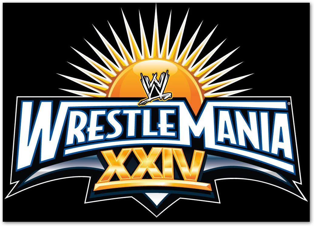
    33 isn't bad - but when you compare to 24, the last WM held at the Citrus Bowl, it looks so plain.


  26. #26
    Main Eventer
    Join Date
    Jan 2013
    Location
    Searching for The Law
    Posts
    5,218
    Mentioned
    83 Post(s)
    Tagged
    0 Thread(s)
    Rep Power
    117442
    13 is the worst.

    30 is the best.

  27. #27
    an affront to god mth's Avatar
    Join Date
    Mar 2001
    Location
    YXE
    Posts
    62,280
    Mentioned
    366 Post(s)
    Tagged
    0 Thread(s)
    Rep Power
    2943295
    13 is poop. No real issues with the rest of them.

Posting Permissions

  • You may not post new threads
  • You may not post replies
  • You may not post attachments
  • You may not edit your posts
  •